Tag: Hello World
All blog posts-
Season 6 of the Hello World podcast is here
Our first episode asks: Do kids still need to learn to code?

-
Hello World #23 out now: Global exchange of computing education ideas
Stories and research on computing education from over 20 countries

-
AI isn’t just robots: How to talk to young children about AI
Help your kids understand AI tools and their limits

-
Hello World #22 out now: Teaching & AI
A snapshot of the current landscape of AI education

-
Introducing the Hello World newsletter
News from Hello World and the Foundation in your inbox every month

-
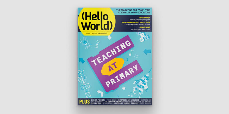
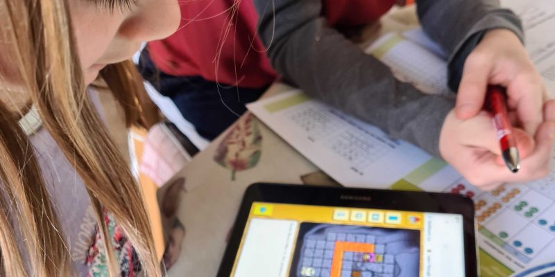
Hello World #21 out now: Focus on primary computing education
Inspiration and ideas for computing education in primary school
-
Preparing young children for a digital world | Hello World #21
It’s about children's right to be active citizens in the digital world
-
Computing curriculum fundamentals | Hello World #20
Computing systems need to be at the heart of computing curriculum design

-
Reflecting on what we teach in computing education and how we teach it
Our special editions of Hello World help you reflect on your teaching
-
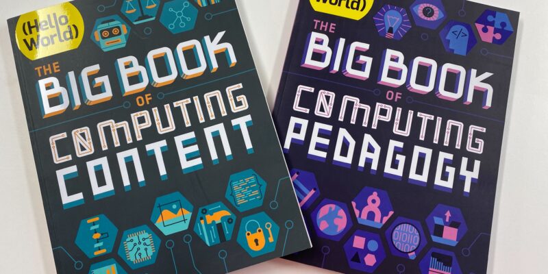
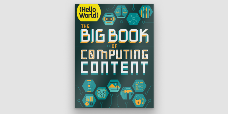
Out now: Hello World’s special edition on Computing content
A Hello World special issue about what we teach in the Computing classroom
-
A taxonomy of Computing content for education
Describing the diverse range of concepts and skills that comprise Computing
-
Back to school 2022: Our support for teachers
See the breadth and depth of teacher support we offer you